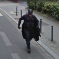
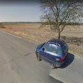
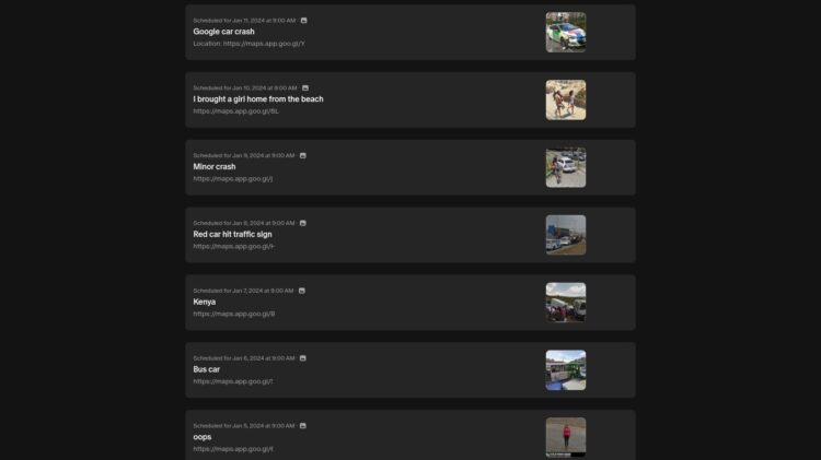
We’ve made some changes to the design over the last couple of days as you may have noticed. The main differences are larger images and a less cluttered impression. It should also be easier to see tags and categories for an image now.
The Top 100 page of the best Street View images has been completely remade and all ratings are now updated live. For each country we have a top 25 and once we get some more ratings it will change to 50 and 100.
If you visit Google Maps to find new sightings, then maybe take an extra look at the countries with surprisingly few images in our Top Lists: Czech Republic, Finland, Hungary, Ireland, Norway, Portugal and Taiwan. Find anything interesting? Send it our way.
You can now find the toplist for each country below the Top 100 main page.
We hope you like the changes! If you notice any issues, have any suggestions or questions, please let us know in the comments.


Yes, its good! Good and useful innovations. The only remark: would like to see the letters of the headings some larger (the font itself is good).
And now lost autor’s logins in posts, its bad 🙁
Thanks for your feedback. I’ve increased the title headings now from 20px to 30px.
Author login in posts… I’ve made a Login link at the bottom of the Sidebar now. Is this ok?
Yes, now title headings is good, but autor’s nicknames in posts I don’t see…
Thanks, author and leave a comment has been added now.
Yes, now I see and now all right.